Truedat contains an administration module to manage dynamic forms to be used by different type of documents within the application. This will allow the administrator to customize the fields to be displayed in different features. We call the definition of this forms template.
Templates can be defined for:
Business Glossary: Each template defined in the Business Glossary scope will define a new type of business concepts. You will be able to customize which types of business concepts you want to have and the fields that need to be documented for each of them. Examples: Metrics, Attributes, Business Term, Policy.
Data Catalog: Although most of the information in the Data Catalog is discoverd automatically using the corresponding connectors, you are able to define aditional information to be documented manually. This will be done with templates with Data Catalog scope.
Quality Rules: Usually a single template in which you will define your customized fields to be added to your Quality Rules. This will help implement your Quality Model giving you total freedom to define Quality Principles, criticity, weight or whatever attribute you want to have within your quality rules.
Quality Implementations: Usually a single template to define customized fields at a quality implementation level.
Grant request: You could define templates to be used when requesting access to data.
Remediation plan: In order to add additional information such a remediation plan to the result of the execution of quality implementations, a template has to be defined. This will include all the relevant information, e.g. name of the remediation plan, date for its implementation, owner of the plan, etc.
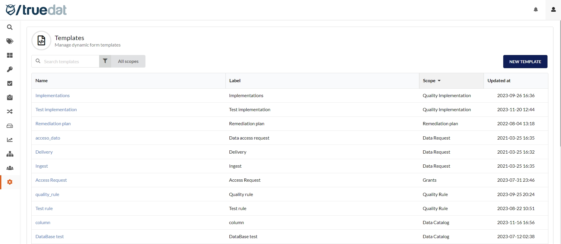
You will find this option in the administration panel where you will be able to see a tab for each of the modules using templates.
To create a new template just use the corresponding action "New template". You will get following form to be completed:
Common fields for all templates:
Name: It must be unique in the application, it is the code that identifies the template.
Label: User name for the template. Will be used when presenting this template to any user.
Scope: Module where the template will be used. It must be one of the following.
Subscope (only for Business Glossary): business concepts using a template with a subscope will be displayed in a separate menu option under Glossary once they are published. The subscope will be the name of the menu option.
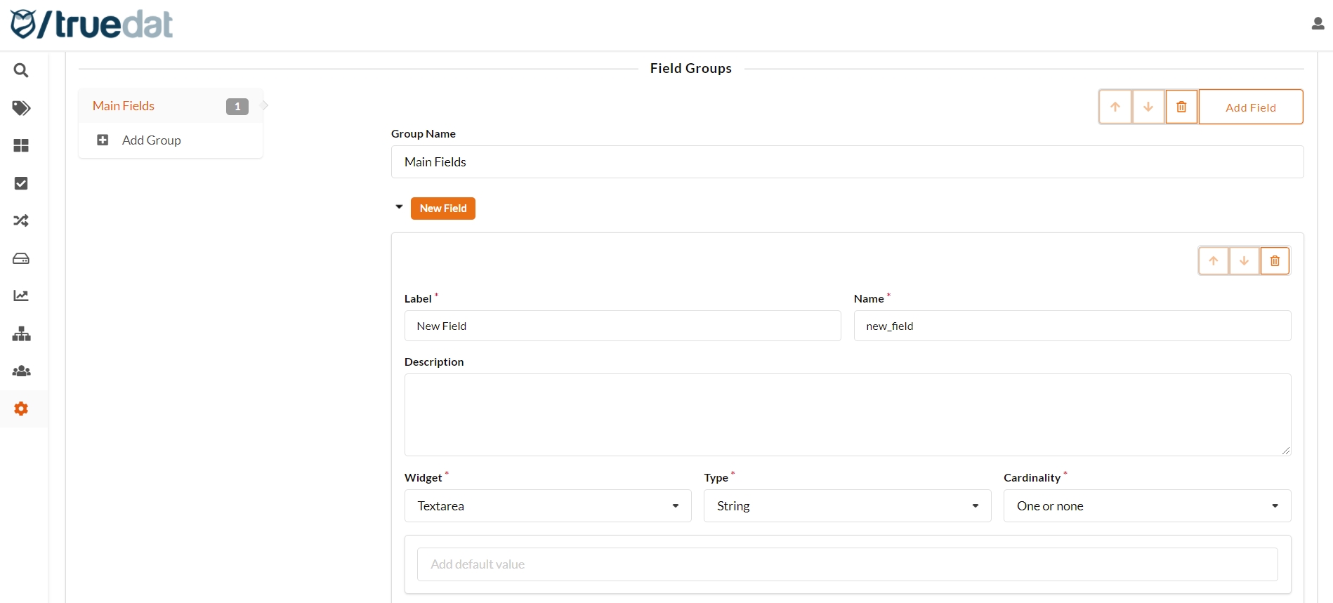
Templates consist of a number of fields grouped by any group you want to define. In case that you have long forms it is recommended to define fields groups to facilitate the user understanding of the document.
The group name must be unique when saving the template. If there are groups with the same names, their fields will be merged into a single group.
Inside each group, you can setup new fields and define their order.
Field setup will allow several options:
Label: Text used in the form to display the field.
Name: Field code, must be unique in the template and must not have spaces. This value cannot be modified once the template has been saved. If you use this same name in other templates, the field needs to have the same definition.
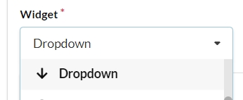
Widget: Component used to select the value of the field. It will be explained in detail in next section.
Type: Field data type. Available types will depend on selected widget.
Cardinality: indicates whether it is single or multiple, as well as whether it is mandatory or not:
One or none: single value not required
One: a required single value
None or more: A list of values from which several can be chosen on a non-mandatory basis
One or more: List of values where at least one must be indicated but allows multiple value to be selected.
Editable: if a field is marked as non-editable, once it is filled out in the template, it will not be possible to modify its value.
Searchable: all fields are marked as searchable by default which means that when you perform a search by text the search engine will look for a possible match in the content of the template field. If you disable it, it will be ignored in the searches.
Search boosting: you can set a value of how important a field is to the searches. Boosting allows to customize your search results by promoting or deprioritizing content of the fields in your templates.
1.0: neutral (value by default)
above 1.0: to give priority to the content of the field
below 1.0: to lower the priority
Values : Possible values to be selected by the user. Depends on widget.
Fixed list: Allows you to add a list with the possible values of the field.
Key/Value list: Defines a list with the code that will be saved as a value and the label that will displayed to the user. This allows to change the label in the future without having to change all the documents.
Depending on another field: You can define a fixed list for each possible value of another field in the template. For example, if there was a "Country" field, there could be a "Region" field where the possible values would change in relation to the value selected in the "Country" field. This type of field also allows to define the default value based on the value of the dependency field.
Dependent on domain: You will be able to provide a different set of possible values depending on the domain selected for the concept, structure, quality rule o quality implementation.
Default value: For "Fixed list" or "free text" type values, a default value can be entered. This will result in the field being pre-populated with this default value when a document is created from the corresponding template.
Conditional visibility: The visibility of the field will depend on the value of another field. This will allow to activate a field depending in a list of values from a previous field.
Mandatory dependency: Field will be mandatory depending on the value of a previous field.
Subscribable: In case that this option is checked, this field may be used as a filter when setting up subscriptions by role.
They are the different components that can be selected for the form. There is a very specific correlation of which components can be used with each Type, Cardinality and Values.
Widget / Example
Information
Type: String Cardinality: None (autogenerated) This field is automatically populated with an autogenerated id that cannot be modified.
Depending on cardinality is single value, a normal Input will appear. If it is multi-valued, it allows you to press the enter key and add multiple values.
Input text with a box
Add link and value pairs. When viewing, a button with the text appears and you navigate to the link by clicking on the button.
Widget that allows you to enter a text with rich text format allowing you to underline, bold, italicize, numbering, bullets and links to web pages.
Type: Table
Cardinality: One or none
It allows defining a table to be filled in by the user of the template by specifying the list of columns in the table to be completed.
Type: Text string
Cardinality: One or none / One / None or more / One or more
Allows a text field to be masked so that it is not displayed on the screen when entering data or consulting the template.
Type
Integer
Decimal
Cardinality: One or none/ one
Allows you to display a field that will only allow you to enter numeric data
Type: Date
Cardinality: One or none/ one
It will show a calendar widget for selecting a date
Type: Date Time
Cardinality: One or none/ one
It will show a calendar widget for selecting a date and time.
If the values are users or groups of users of a Role then the Type must be 'User'/'User or Group'. For the other 3 possible values: Fixed list, Code / description list or Depending on another field, the Type must be 'String':
Drop-down to select the value/s
You will be able to choose between:
String,
System,
Domain,
User,
User or Group,
and Hierarchy.
If ''User' or 'User or group' are selected, the role of the user list to be displayed needs to be specified.
If "Hierarchy" is selected, a list with the available hierarchies will be displayed to be selected. Indicate the minimum selectable level (top level is 0 and allows to select any level).
Values presented in a list with the possibility of choosing one.
Values presented in a list with the possibility of choosing several.
Widget / Example
Description
Type: Image
Cardinality: One or none/ one
Allows you to attach an image to the form with a maximum of 2 MB
Description: It is not mandatory. When a value is indicated in this field, a button will appear on the form, which will show this description when clicking on it.


